Showing posts with label responsive. Show all posts
Showing posts with label responsive. Show all posts
Tuesday, March 14, 2017
Download MaxMag Responsive Blogger Templates
Download MaxMag Responsive Blogger Templates

MaxMag is magazine style blogger template built in with responsive design. This blogger responsive templates come with 3 column design and the sidebar was all on the right side, one is suitable for 160x600 pixel ads and the other is match for 300x250 pixel ads. You can also use 728x90 pixel ads and 222x90 pixel ads before the navigations menu.
White is the main color of MaxMag responsive blogger templates and the secondary color are grey and green, the colors combinations look perfect and eye catching for news magazine blog. This responsive templates also had use news ticker, featured content slider and sticky multi drop-down menu.Demo | Download
Available link for download

Wednesday, March 8, 2017
Johny Ajaib Responsive Blogger Templates
Johny Ajaib Responsive Blogger Templates

Johny ajaib responsive blogger templates is simple and fast loading blogger responsive templates who created by Maskolis. This blogspot templates already using auto read more functions. Come with 1 sidebar on the right and 3 column footer, Johny ajaib templates has implements dynamic tag heading for H1 tag and H2 tag. You can check on the home page and the post page the functions of dynamic tags heading was working correctly, we all know this was good starting for search engine optimizations.
Using grey color as a main color, this free blogspot responsive templates was looking good when combine with red and black color as a seconder colors. On the header besides the blog title we can use 728x90 pixel ads size and in the sidebar this match for placing 300x250 pixel ads.Demo | Download
Available link for download
Monday, March 6, 2017
Johny Asal Responsive Blogspot Template
Johny Asal Responsive Blogspot Template

On the right sidebar of Johny asal responsive you can use 300x250 pixel ads and on the footer you can use up to 3 widgets sections which was already designed. Grey is the main color and on the header and footer you can see there are a big dark vector design out there.
To make this responsive blogger template working properly, if you use image o your post, you should host the image in blogspot or picasa because if not, the thumbnail on the homepage and the related post will disappear.
To make this responsive blogger template working properly, if you use image o your post, you should host the image in blogspot or picasa because if not, the thumbnail on the homepage and the related post will disappear.
Demo | Download
Available link for download
Sunday, March 5, 2017
BeTheme v12 1 Responsive Multi Purpose WordPress Theme Download Free
BeTheme v12 1 Responsive Multi Purpose WordPress Theme Download Free

BeTheme Responsive Multi-Purpose WordPress Theme Download Free
BeTheme WordPress Theme, Updated Version Is Available On This Page.
Responsive WP Theme : You can use this theme for many purposes like for university sites, blogs, sites, online shopping or even for GYM too, You can see the updated version on Themeforest. We also provided updated version here too. Current Version is 12.1 was updated on Feb, 2016.
- BeTheme is a fantastic and incredible Responsive Multi Purpose WordPress Theme and this wordpress theme comes with lots of features like 3 different blog layouts, 4 different portfolio layouts plus this theme is compatible with child theme too.
- BeTheme WordPress Theme is gifted with Visual Composer Plugin and its worth is 28$ in market but its free with theme and you can create complex layouts with this plugin plus over 300 vector icons are also included inside it.
- People usually looking for new and advanced features and this WP Theme is capable with Drag and Drop Page builder and advanced options panel, which means you can easily show your work to others plus we are sure that you work will look more attractive with this theme.
- It’s 15 Thematic Websites and different pre defined demo makes it perfect to our valuable users plus we have made some new improvements inside this on users demand and our experts focusing on this theme to make it more attractive.
- We are offering 18 PSD files with ui kit included means these are useful for those who wants to modify or customize the theme design plus inside this theme each page contain different layout, header, logo and more.
- We have added some new features in this theme such as Added main style select, Added layouts or sticky header logo and sticky retina logo, Added RTL means flat box item and shortcode or updated revolution slider upto 4.6.92, visual composer upto 4.5.1 and more.
- Some issues are also resolved inside this latest version of BE and those are Fixed overlay menu – font select or Fixed internet explorer means image width and height attribution from image meta and more.
Whats New:
We made some improvements inside this theme or you can say that we made some changes in this WP Theme on our valuable customers demand and we are pretty sure that you’re gonna enjoy it. Changes are mentioned below:
Updates of BeTheme v11.9:
- Will be displayed soon.
Updates of BeTheme v10.7:
- Added new RTL muffin builder.
- Added new parallax translated.
- Added new portfolio style list in background color select.
- Resolved an issue with layout boxed in menu align right.
- Resolved an issue with Header split semitransparent in sticky header.
- Resolved an issue with iframe width in blog.
- Resolved an issue with feature image or hide.
- Resolved an issue with search results keywords.
- Resolved some minor issues in php.
Download Link:
BeTheme v12.1 WP Theme Free Download
BeTheme v12.1 WP Theme Free Download
Available link for download
Thursday, February 23, 2017
Incipient Responsive Blogger Template
Incipient Responsive Blogger Template
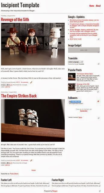
Incipient is free responsive minimalist blogger template who created by blogger buster. If you want clean and clear template for you blogspot blogs with responsive design, Incipient is one of your best choice because this template was made for that.
This blogger responsive templates created in 2 column style with white color as main color and if you want to change the color of incipient templates, you can use blogger template designer, no need to change the color manually via edit HTML menu and for note, when you want to use image on your post you should choice the original size placement because this blogger template will automatically shrink your image.Demo | Download
Available link for download
Sunday, February 19, 2017
Made Responsive Magazine Theme For WordPress
Made Responsive Magazine Theme For WordPress

Made v 2.5 Responsive Review/Magazine Theme for WordPress
Made is an industrial strength review, magazine theme powered by a rock solid framework built to showcase your content and proven to increase the amount of time users spend on your site. Two unique skins, unlimited color schemes, and a brilliant array of provided background designs enable you to make Made your own.
BuddyPress & bbPress (BuddyPress Template Pack plugin required) Unlimited customized review mini-sites with 4 ways to rate (numbers, percentages, letters, stars), perfect for topics like:
Laptops, Smart Phones, Tablets,
and Audio/Video products
and Audio/Video products
Movies, Music, and Video Games
Restaurants, Beer, and Wine
Fashion Trends and Clothing
Travel Destinations and Vacation Getaways Automobiles
Books, Magazines, Web Sites, and Comics Casinos,
Pinball Machines, Ice Cream, Puppies,
Pinball Machines, Ice Cream, Puppies,
WordPress Review Themes…Anything you want. User ratings lets your readers submit their ratings and displays the average user rating below the review author’s rating (does not require any plugins).
Works for all kinds of sites from non-review personal blogs to huge content heavy sites like CNET and Good Magazine Responsive design scales from HD to mobile and looks great on all devices.
Tons of premium features such as beautiful TinyMCE shortcode buttons and custom meta fields so you don’t have to remember any shortcodes Optimized, minified, compressed, validated,
and fully WordPress 3.4+ compliant 5-star customer support and active theme development means Made will be relevant for a long time to come Swagger customers:
Easily upgrade from Swagger to Made 50+ theme options for each review type you create so you can customize the heck out of them User ratings – integrated user ratings in addition to the author’s rating criteria, automatically averages user ratings and displays in the review overview, including total number of ratings (without the use of a plugin). See item 30 of the Made FAQ for details on how user ratings work. Google Rich Snippets and schema.org markup so you can display your rating directly in Google’s search results.
Unique background images, logos, icons, layouts, content sliders, color schemes, skins, sidebars, and more for each review type Choose one of four ways to rate your reviews, including:
Numbers between 0 and 10 (with increments of 0.1) Percentages between 0 and 100 (with increments of 1) Letter grades from A+ to F (with pluses + and minuses – for each letter grade) Starsfrom 0 to 5 (with half-star increments) with 5 color options:
Yellow
Orange
Red
Green
Blue
- Unlimited rating criteria, which is automatically averaged into a total score
- Unlimited review meta fields (descriptive summary text about the review)
- Unlimited review taxonomies (review-specific categories)
- Unique animations for each of the 4 types of ratings Featured videos in addition to or instead of featured images (works good for movie trailers, for example)
- Customizable color ranges for ratings add visual cues to how good a particular rating is, just like how Meta Critic works
- 3 unique layouts available for each mini-site’s front page and category archive pages
- 4 custom menus including the top menu, main menu, sub menu, and a footer menu Custom meta field panels so you don’t have to remember any shortcodes
- Create non-rated articles inside of each review type, which means you don’t have to give every article a rating if you don’t want to
- 16 custom widget panels (plus all of your review type unique widget panels)
- 11 custom widgets give you lots of styled widgets to showcase your content
- Integrated randomized, sophisticated advertising network to display ads within your post listings
- 13 additional template position ad spots Slick “About The Author” and jQuery tabbed Related Postspanel under each post/review.
- 80+ shortcodes


Available link for download
Friday, February 10, 2017
Linezap Responsive Blogger Template 2014
Linezap Responsive Blogger Template 2014

LineZap is a simple & clean designed Blogger Template with a great responsive design. This theme perfect for Search Engine Optimization. Its High User Friendly Blogger Template. Its perfect for News, Magazine or portfolio websites with attractive color combination and impressed professionals and has many features. Below mentioned more details about features.
Maxxiz Responsive Blogger Template Free Download
Platform: Blogger
Name: Linezap
Features:
- Magazine, Grid Based and Portfolio Layout
- Auto Resize Thumbnail Image
- Free Premium Template
- 3 Columns Layout
- Tabbed Sidebar Widget
- Recent Post By Label
- Ads Banner Ready
- Related Posts with Thumbnails
- Threaded Comments
- 2 Comment System
- Search Engine Optimized
- Fully Responsive Design
- Auto Author Image
- Newsletter Subscription
- 2 Right Sidebar
- 3 Column Footer Section
- Primary and Secondary Menu
- Sidebar Menu
- Popular Browser Compatible
- Social Follow and Share Icons
- Custom 404 Error Page
- Search Box
- Best news, magazine, tech and portfolio websites
- Blue, Black and White Color Combination

Available link for download
Monday, February 6, 2017
Deep Blog Responsive Blogger Template Free Download
Deep Blog Responsive Blogger Template Free Download

Deep Blog Responsive Blogger Template Free Download
Deep Blog is a Crafted to ENCHANT, the topics been well-thought to inspire your perusers with its reasonable and fresh, responsive plan. Deep Blog Responsive Blogger Template serves a lot of landing page choices, for example, Subscribe boxes, Sliders, Diverse designs and styles to make an immersive ordeal. Everything to the detriment of a tick. Our point was to make a disorder free blogger encounter, which your clients can appreciate and appreciate. Give your blog the high ground and never think back. Deep Blog blogger template is Ads ready and Mobile friendly.
Deep Blog Blogger Template Features:
- Responsive
- SEO Friendly
- Google Testing Tool Validator
- Mobile Friendly
- Custom 404 Page
- Fast Loading
- Minimal
- Ads Ready
- Clean Layout
- Simple Design
- Drop Down Menu
- Social Sharing Buttons
- HTML5 & CSS3
- Browser Compatibility

Available link for download
Friday, February 3, 2017
Maxxiz Responsive Blogger Template Free Download
Maxxiz Responsive Blogger Template Free Download

Template Name : Maxxiz
Template Price : Free
Template Description : Maxxiz a blogger theme with responsive layout. Its High User Friendly Blogger Template. Blogger Responsive Template. Its design simple and clean and perfect for magazine or portfolio websites. Before i have share Flat News Blogger Template and also share Rifqiy v1.35 Blogger Template With an attractive color combination and impressed professionals and has many features.
Features:
- Responsive Design
- Manual Featured Post from Image Widget (Responsive Skitter Slideshow)
- Auto Featured Post (Responsive Skitter Slideshow)
- Support Blogger Template Customize Editor
- Lightweight Auto read-more (support third party image, and Youtube Thumbnail)
- Ajax load more post
- Page Navigation
- Tabs Widgets ready
- Cool blogger threaded comment (Support Google+ Comment)
- JSON Search Result
- Ajax Recent Post by Tag (3 Post Type(Slider, Vertical, and Horizontal) support random)
- Ajax Recent Comment Widget
- Ajax Related Post Widget
- Ajax News Ticker Widget
- Two View Mode (List and Grid) with Cookies
- Optimize SEO
- Meta Keywords And Description Support (Official Meta Description Support)
- Emoticon
- Compatible with major browsers (IE9+,Mozilla,Chrome,Safari,Opera)
- Custom Error 404 Page
- Custom Share widget icon (addthis widget plugin)
- Professional admin layout, help you easy work with blog layout.
- Files Included : JS Files
- Documentation : Well Documented
- Compatible Browsers : All major browsers
Full Screenshot

Demo | Download
Available link for download
Thursday, February 2, 2017
Balance Responsive Blogger Templates
Balance Responsive Blogger Templates

Balance is free responsive blogger templates created by designer who also make Copy Blogger V2 that we had posted before. The designer look understand what Google and most visitors want because when I open the demo templates, wow this was very fast loading but also still give the elegant look. Simple, minimalist, fast loading, elegant and clean design are the main feature of Balance responsive blogger template.
Created in 2 column design with sidebar on the right side and 3 column footer with white as main colors matched with soft brown color make this template look more clean but the designer said this templates also had good SEO structure in it.Demo | Download
Available link for download
Tuesday, January 31, 2017
Simple Clean Responsive HTML 5 V2 Blogger Template
Simple Clean Responsive HTML 5 V2 Blogger Template

Blogger Template Simple Clean Responsive HTML 5 V2 is valid HTML 5 blogger templates with responsive and clean design, the SEO structure of this template was very good on the home page and also on the post page was great.
The post page on the front was split on 2 column style with one sidebar on the right and the footer widget was designed in 3 column style. Simple clean responsive HTML 5 V2 designer has giving extra attentions to this template SEO structure, almost all the basic on page SEO structure has been implemented on this free responsive blogger template like, fast loading, valid breadcrumb navigations, dynamics heading and related post.
Demo | Download
Available link for download
Friday, January 20, 2017
Main Photo Blogger Responsive Templates
Main Photo Blogger Responsive Templates

Main Photo is clean and minimalist blogger responsive templates like Incipient templates and designed in 2 column layout with the sidebar on the right and on the footer has 3 column design. This template support blogger template designer so you can edit font size, font type and the colors of this free responsive blogger templates.
Grey and white is the main color on Main Photo blogger template. On the sidebar you can place ads with size 300 x 250 pixel and 2 ads with size 125 x 125 pixel like on the demo templates. This template support looped slider image slider based on the post label, if you want to use it just change with your label name on the content sections of this widget (label name is case sensitive).Demo | Download
Available link for download
Wednesday, January 18, 2017
Responsive HTML5 V 6 Blogger Templates
Responsive HTML5 V 6 Blogger Templates

Responsive HTML5 V.6 blogger templates is a unique free responsive blogger template with great SEO template structure. Unique because on the homepage you will found 2 sidebar on the left and the right side but when viewing on the post page you will only found just 1 sidebar on the right side.
I said this free blogspot template has a great SEO structure because this template was valid HTML 5 design structure, has implementing Google search rich snippet and the heading was also dynamics. If you see the structure you will see on the homepage the blog title was using H1 tags, the post title using H2 tags and the widget title are using H3 tags, very good and when go to the post page the post title tags was change to H1 and the blog title didnt use any tags. Demo | Download
Available link for download
Borneo Responsive Templates
Borneo Responsive Templates

White is the main color used in this blogspot responsive templates and you can see light and calm blue color on the navigations sections. If you want to use image as the header tittle of your blog like on the demo site you need to prepare image with size 220 x 90 pixel.
Demo | Download
Available link for download
Subscribe to:
Posts (Atom)